
Grab bag
**********
Real People.
I saw this lady sitting on the sidewalk outside a designer label store in Macau. It struck me as a little sad -- her kind have probably been there for ages, but it's the Johnny-come-latelies who are inside, in the world without strangers. It doesn't help, of course, that her face is so alive, and they are headless mannequins, and the Real People of her ilk are all hazy reflections.
 Macau, June 2006
At the florist.
Rich people need things to put their flowers in. Glass can glitter like gold. The cold, sharp feel of the reflections is tempered by the soothing ceiling lights in a happy reversal of contrasts, and the strange shapes of the artifacts on the bottom shelves offer the eye recesses to linger. A trip to the flower market that would have been a nightmare if I hadn't had my camera to distract me. 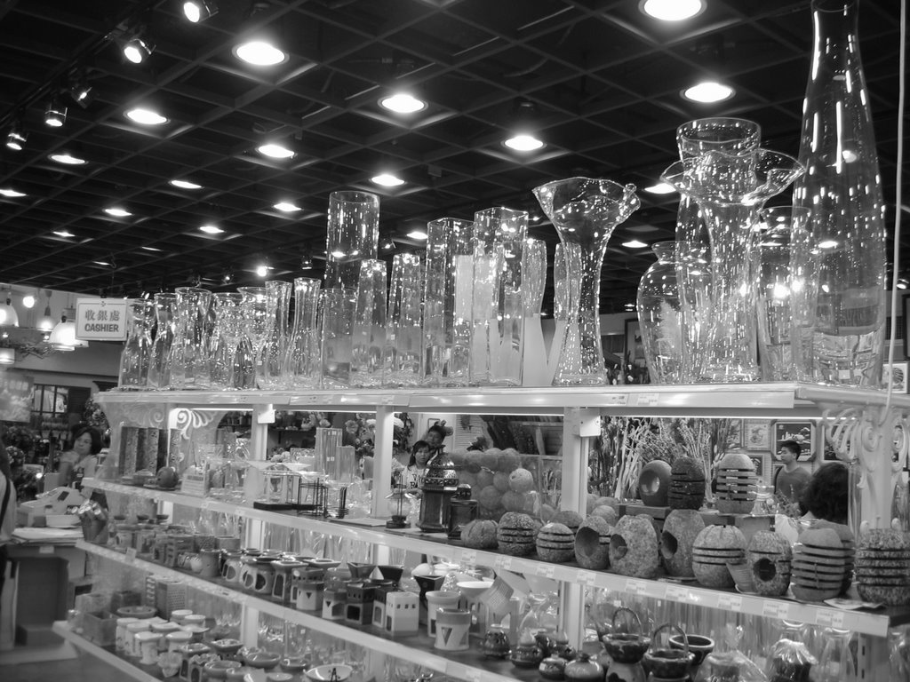 Hong Kong, July 2006.
The Garden Path.
Looking out on a little strip of lawn, and the muddy driveway beyond. A dreamy feel to this picture belies the fact that it's a hot and humid afternoon in a dusty Western corner of India.
 Ahmedabad, July 2006.
In Perspective.
A reflective image of young Toto, dachshund, in vacant or pensive mood. I particularly like the visual puns that suggest themselves here. Delhi, August 2006.
Framing.
This is in Hong Kong, looking across at Central from the Avenue of Stars on the Kowloon side. I like this perspective because it looks along the harbor rather than directly across, as most pictures do. So in a sense one is looking with the amazing skyline, not at it. That doesn't seem to trouble the people in the foreground, busy with their trivial play. 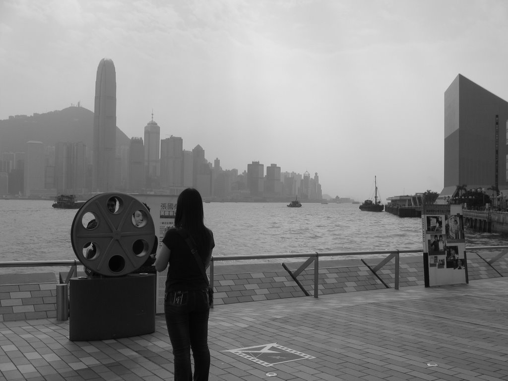 Hong Kong, September 2006.
Gone Fishing.
Fresh fish tastes especially interesting if it is caught for you by a man wearing a black suit. This impromptu performance topped out a happening dinner.
 Hong Kong, November 2006.
Distance.
This picture isn't perfect. I would have liked the figures to be more clearly specified -- the runner to be better silhouetted, the age of the two walkers to be more apparent. But there's something about it that makes me feel just very sad.
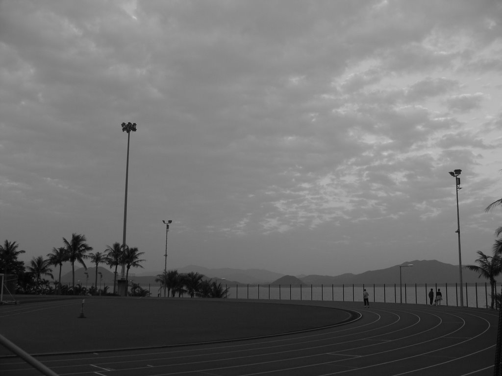 Hong Kong, November 2006.
Ashes.
With a Buddhist twist. Topical.
 Hong Kong, December 2006.
Journey (or, The Ups and Downs of Life).
Some of us can't see our destination so clearly, or so centered. Sometimes it's a risk, and sometimes it's a fraud. But we're committed.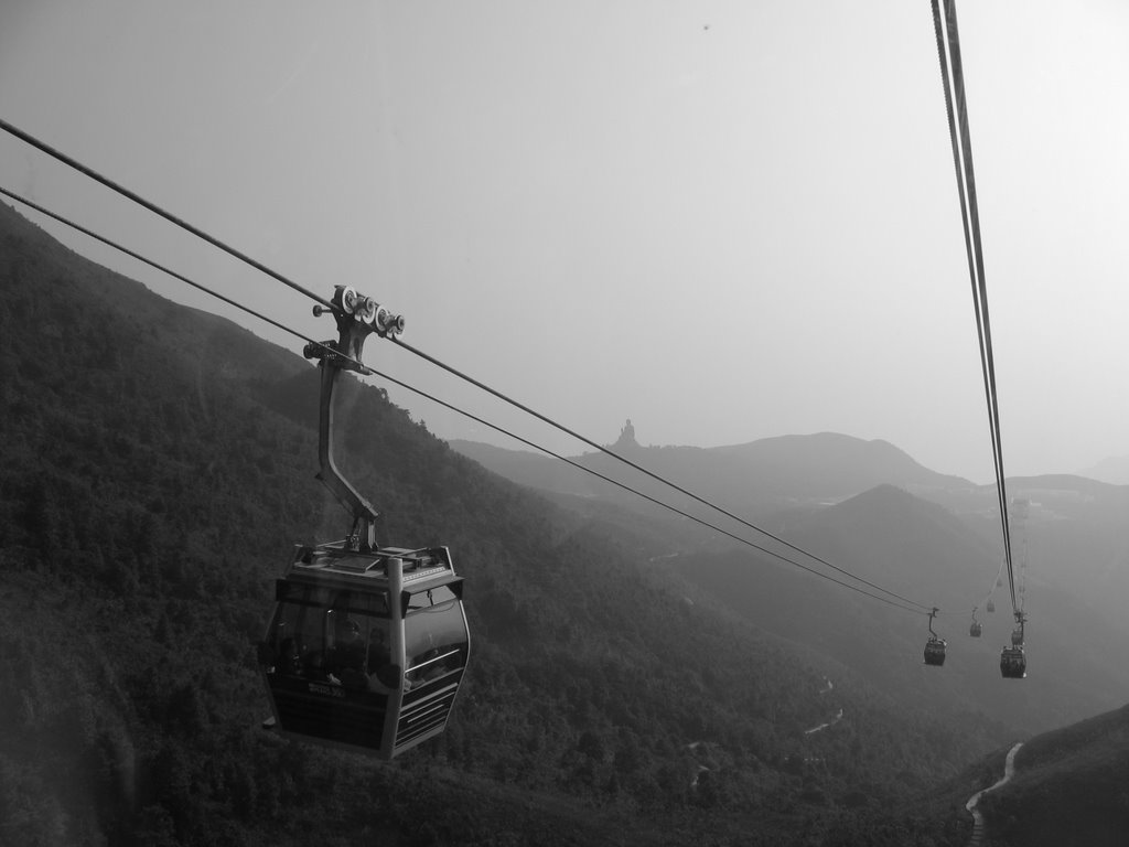 Hong Kong, December 2006.
posted by Tabula Rasa | 12/10/2006 11:39:00 AM
![]()
![]()
14 Comments:
Cool pics, TR! Thanks for sharing them.
Now we know what you did [er, where you were] last summer.
nice post. i really liked some of the pics. enjoyed the comment to each too, but was left wishing you had merely titled them. i ended up seeing most through your lenses! when i visit next, i will not read, i will only view. :)
I like the Ahemdabad one a lot. Your black and white photos could do with more contrast. I would have shot photos like the first one with a high speed film setting. With the speed you have used, you might have done better with a close-up portrait.
Depressingly good.
What's a visual pun?
J.A.P.
abi:
thanks :-D
kundalini:
hmm, sorry!
ws:
ah, nice insight - thanks! i've been wondering what's wrong. the runner photo looks much nicer if i tweak the contrast a little (you can see the sea clearly, etc.) but it's not just a film speed thing, for instance, some of the color shots i'm taking are looking washed out as well.
jap:
but cheer up, as ws points out, they could be better.
i guess a visual pun are things along the lines of "dim", "illuminated", "reflective", and "trains of thought" - for that particular picture.
Very nice. Although as wildflower seed pointed out, some of the b&w ones seem a little too grayish - not enough contrast in a few of them.
Liked the last one a lot though. Was that on Lantau Island?
[Why do I always get the *really* long verifications?]
Ooh...very pretty pics. I like the little snippets that come with each one. Makes them come alive.
Beautiful. I don't know enough about photography to offer any suggestions, but I loved the fact that an upscale designer store in Macau would have a small proclamation of support to the Brazillian football team in their shop window. Was it a French label? Now that would have been ironic.
I liked the one of the pf the girl looking at the the HK skyline a lot. It's very different from the usual pictures one associates with that area....
Maybe I should take B&W pictures in London...there are very few colours here...I tried to find some but it's difficult work! (refer blog)
salil:
thanks, yes, that one was on the cable car to the buddha (which you can see in the distance).
how do i increase contrast? reduce the aperture?
m:
thank you :-) i guess i get to please either you or kundalini at one time!
mt:
funny! actually it wasn't that much of a label - it was adidas.
szerelem:
ya, it's satisfying to get a nice angle on something so familiar. the girl isn't looking at the skyline, you know. she's looking at her boyfriend who's posing like an idiot behind the reel. you can see his face alongside that of the model on the poster beside him, in between the holes in the reel.
i somehow associate your pictures with bright colors, so i'd expected to see some on the ones you'd posted. of course that's an unrealistic expectation for london in december. feel free to try b&w -- i love it. (so much so that someone told me the other day that WS and i haven't heard about the invention of technicolor yet.)
This website may have some answers : http://photo.net/
i loved em. are you a closet photographer, prof?
and this is my cue to start running before a heavy marketing text, maybe a kotler, hits me smack in my face. :D
Fiddling around with the aperture (especially if it's digital) may help. Not really experimented that much.
Most of the B&W photography I did was with an old film SLR camera, and to try and increase the contrast in the shots, I'd hook coloured filters up to the lens. Rule of thumb is to generally try and use a filter or two with a tint that wasn't as strong in the main subject(s). So on the Hong Kong skyline shot, maybe something like a green or red to bring out the blue contrast in the background a little better.
ws:
thanks - great link.
scout:
oh yes, i love photographing closets. wanna see my collection?
(nice idea on the kotler, btw. would make a great missile. heat-seeking.)
salil:
good tip, thanks. i wish i had the patience to sit and fiddle with the same shot, different exposures and apertures. but would that take away the fun of being an amateur?
Post a Comment
<< Home